How Weather Maps Use Symbols to Show Complex Data
Explore how weather maps utilize symbols to represent complex meteorological data clearly and effectively for accurate forecasting.
Weather maps are essential tools in meteorology, providing a visual representation of atmospheric conditions across various regions. These maps use a range of symbols to represent complex data such as temperature, pressure, precipitation, wind direction, and cloud cover. Through standardized, easy-to-understand symbols, weather maps transform intricate meteorological information into a format that can be quickly interpreted by scientists, meteorologists, and the public alike.
The origins of weather maps date back to the 19th century, when the need to visualize weather observations became apparent. Early meteorologists began plotting data points such as temperature and barometric pressure collected from different locations. As technology advanced, so did the symbols used on these maps, evolving to represent a broader scope of weather phenomena in a concise manner.
Standard Weather Map Elements and Their Symbols
A typical weather map comprises several key elements, each represented by specific symbols to convey information effectively. These elements include pressure systems, fronts, precipitation types, cloud cover, wind speed and direction, and temperature gradients.
Pressure Systems: Areas of high and low atmospheric pressure are crucial in forecasting weather patterns. High-pressure areas, often associated with clear skies and calm weather, are marked with an uppercase blue 'H'. Low-pressure zones, which may bring storms or unsettled weather, are indicated by a red uppercase 'L'. These symbols help meteorologists and readers quickly identify weather tendencies across a map.
Fronts: Fronts represent boundaries between air masses with differing temperature and humidity. They are essential in predicting changes in weather. Various lines and shapes symbolize different front types. A cold front is depicted as a blue line with triangles pointing in the direction of movement, denoting advancing cold air. Warm fronts use a red line with semi-circles that point to warmer air pushing forward. Occluded fronts combine triangles and semi-circles on a purple line, indicating where a cold front overtakes a warm front. Stationary fronts, indicating a boundary between contrasting air masses that are not moving significantly, are shown with alternating blue triangles and red semi-circles on opposite sides of a line.
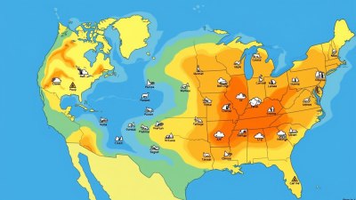
Precipitation Symbols: To represent different types of precipitation, weather maps use unique shapes and icons. Rain is often denoted by dots, with the number or size sometimes indicating intensity. Snow is symbolized by asterisk-like shapes or snowflake icons. Freezing rain, sleet, and mixed precipitation might be represented by small combinations of dots and asterisks or specialized symbols to differentiate them. These icons enable quick recognition of precipitation types at specific locations.
Cloud Cover: The amount of cloud cover is vital to understanding weather conditions. Meteorologists use circle symbols filled or shaded in different ways to represent cloud coverage. An empty circle indicates clear skies, a fully shaded circle represents complete cloud cover, and partially shaded circles depict varying degrees of cloudiness. The use of these symbols allows for straightforward comprehension of sky conditions without lengthy descriptions.
Wind Direction and Speed: Wind is depicted using wind barbs or arrows placed on the map at various locations. The direction the barb points indicates where the wind is coming from, and feathers or flags on the barb show wind speed. Each full feather typically represents 10 knots, a half feather denotes 5 knots, and a pennant flag symbolizes 50 knots. This standardized system makes it easy to visualize wind patterns and velocity within any region on the map.
Temperature Gradients: Though temperature is often indicated numerically at specific stations on a weather map, color gradients or contour lines called isotherms are also used to show temperature distribution over larger areas. Isotherms connect points of equal temperature and help illustrate temperature changes and transitions smoothly across the map.
Interpreting Complex Weather Data Through Symbols
Weather maps condense multitudes of meteorological data into a detailed visual language. The use of standardized symbols on these maps ensures clarity across international boundaries and professional disciplines. Meteorologists analyze these symbols collectively to forecast weather changes accurately.
For example, the interaction between a cold front and a low-pressure system, visible through symbols on the map, can indicate the likelihood of thunderstorms. Similarly, the presence of tightly packed isobars, represented by lines connecting equal pressure, suggests strong winds. The combination of these symbols allows forecasters to interpret the dynamics of the atmosphere quickly.
Symbols also help in identifying severe weather warnings. Special icons such as tornado symbols, hurricane symbols, or thunderstorm markers are overlaid on maps to alert viewers of dangerous conditions. Color coding alongside symbols enhances readability by providing intuitive clues about intensity and severity.
The Role of Technology in Symbol Use on Weather Maps
Advancements in satellite technology, radar, and computer modeling have significantly expanded the range of data presented on weather maps. Modern meteorologists use sophisticated software that automatically integrates data and assigns appropriate symbols in real time. Interactive digital maps offer dynamic symbol changes, allowing users to zoom in on regions or select different layers displaying various elements like precipitation, wind, or temperature.
Mobile applications and online weather services now employ these symbology conventions to keep users informed. Clear, simple symbols help non-experts comprehend otherwise complex and technical weather information, enhancing public safety and awareness. This democratization of meteorological data empowers individuals to make better decisions based on weather forecasts.
Challenges and Limitations of Weather Map Symbolism
While symbols improve the comprehension of weather data, some limitations exist. The need to represent vast and detailed phenomena in a compact form can sometimes oversimplify the underlying data. For example, a single symbol for a warm front may not convey the intensity or duration of weather changes associated with that front.
Additionally, symbol interpretation requires some initial learning. Although standardized, variations can occur between countries or organizations, which may confuse users unfamiliar with specific conventions. To mitigate this, weather services provide legends and educational resources to explain the symbols used on their maps.
Another challenge is incorporating new types of weather data as meteorology advances. As sensors evolve, new phenomena may be mapped, requiring updates or additions to the symbol set to maintain clarity and utility. Balancing the complexity of data representation with the simplicity of symbols remains a dynamic aspect of weather map design.
Historical Progression of Weather Map Symbols
The development of weather map symbols has been a gradual process influenced by scientific discoveries and technological innovation. Early maps, drawn by hand, used rudimentary symbols or written annotations. The adoption of telegraph technology in the mid-1800s allowed the rapid collection and transmission of weather data, catalyzing the creation of more detailed maps.
By the early 20th century, international agreements on meteorological symbols helped standardize maps so that forecasts could be shared globally. The World Meteorological Organization (WMO), established in 1950, played a significant role in creating uniform symbols and coding systems used in synoptic weather maps.
Today’s weather map symbols benefit from computer-generated graphics, ensuring precision and consistency. Despite technological progress, the basic principles of succinct, standardized symbol use remain central to effective meteorological communication.
Examples of Weather Map Symbols in Use
A practical understanding of weather map symbols can be gained by examining typical daily weather maps. For instance, a map showing the approach of a cold front over a metropolitan region might feature blue triangles along a line, indicating the front’s movement. Nearby, clusters of dots could denote rain showers following the front. Wind barbs may point from the northwest, signaling the direction of the incoming cooler air.
Similarly, a hurricane tracking map uses a swirling symbol to indicate the storm’s center, with concentric circles showing intensity zones. Color-coded shading around the symbol may exhibit predicted rainfall or wind speeds. These visual cues enable rapid comprehension of an evolving weather scenario.
In aviation, weather maps include additional symbols like cloud ceiling heights and turbulence, crucial for flight planning. Maritime weather maps often emphasize wave heights, sea-level pressure, and fog indicators, all represented through specialized symbols relevant to safe navigation.
Educational Importance of Weather Map Symbols
Understanding weather map symbols is fundamental to meteorology education. Students and enthusiasts learn to decode various icons, lines, and patterns early in their studies. Mastery of this visual language enables them to predict weather phenomena and communicate findings effectively.
Outreach programs and public weather briefings often include explanations of these symbols, making weather-related information more accessible. This education also builds public trust in weather forecasts, as users can see the data behind predictions visually represented on maps.
Many weather websites include interactive maps with hover-over explanations for each symbol, aiding learning and regular usage. As weather becomes an increasingly vital part of daily decision-making due to climate variability, symbol literacy continues to grow in significance.
How Future Trends Might Affect Weather Symbols
Looking forward, innovations in meteorological data collection and visualization may influence how weather map symbols evolve. Enhanced satellite imaging and artificial intelligence could enable more detailed, real-time symbolization that captures weather complexities more fully.
There might be increased integration of 3D and animated symbols, especially in digital platforms, to express temporal changes and weather dynamics dynamically. Augmented reality technology could also make it possible for users to see symbolized weather data overlaid on real-world views through mobile devices.
Nevertheless, the core goal remains unchanged: to represent complex atmospheric data in concise, intuitive symbols that aid understanding, safety, and preparedness. Continuous collaboration among meteorologists, graphic designers, and technologists will shape the future of weather map symbology.
Overall, weather maps serve as a bridge between raw meteorological data and actionable weather insights by using a well-established system of symbols. These symbols provide an efficient, universal language to communicate the intricate behavior of the atmosphere to diverse audiences.