How to Read a Weather Map Like a Meteorologist
Learn to read weather maps with expert tips and techniques used by meteorologists to understand weather patterns and forecasts.
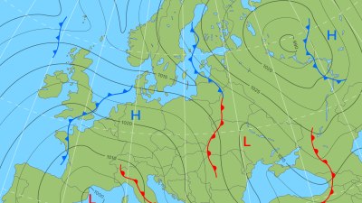
Image by user4468087 on Freepik
Understanding how to read a weather map is a valuable skill that can help you interpret weather forecasts more accurately and prepare for changing conditions. Weather maps are visual representations of meteorological data collected from various sources, including satellites, weather stations, and radar. They display information like temperature, pressure systems, fronts, wind direction, and precipitation. This article will guide you step-by-step through the essential components of weather maps and demonstrate how meteorologists use them to predict the weather.
Types of Weather Maps
Weather maps come in different types, each serving a unique purpose. Common types include surface weather maps, upper air maps, radar maps, and satellite maps. Surface weather maps show conditions at ground level, including temperature, dew point, wind, pressure, and fronts. Upper air maps provide data about the atmosphere at various altitudes, which is crucial for understanding storm development and movement. Radar maps detect precipitation, indicating rain, snow, or hail. Satellite maps reveal cloud cover and large-scale weather systems.
Learning to read each type of map expands your understanding of meteorological patterns. However, surface weather maps are the most frequently used and easiest for beginners to interpret, making them a great starting point.
Understanding Pressure Systems: Highs and Lows
One of the key features on a weather map is the depiction of pressure systems. These are areas of high pressure (marked with an H) and low pressure (marked with an L). High-pressure systems are generally associated with fair, calm weather. They occur when air descends, preventing cloud formation. Conversely, low-pressure systems indicate rising air, which cools and condenses to form clouds and often precipitation.
The arrangement and movement of these systems largely govern local weather. Identifying a low-pressure area moving toward your region may signal an approaching storm or rain, while a high-pressure area typically means clear skies and stable weather.
Temperature and Dew Point
Temperature values are usually plotted on weather maps using numbers or color gradients. These temperatures represent readings at the surface and can indicate weather conditions. The dew point, often shown alongside temperature, is the temperature at which air becomes saturated with moisture and dew forms. Knowing the dew point helps assess humidity levels and the likelihood of fog or frost.
When temperature and dew point values are close, the air is nearly saturated, which means humidity is high. This situation often leads to fog, clouds, or precipitation. On the other hand, a large gap between these two values signifies dry air.
Fronts and Their Meaning
Fronts are boundaries between air masses with differing temperatures and humidity. Meteorologists mark them clearly on surface weather maps using specific symbols and colors. A cold front is typically represented by a blue line with triangles pointing in the direction of movement. It indicates a cold air mass is advancing, pushing warmer air upward, often producing thunderstorms or a drop in temperature.
Warm fronts appear as a red line with semicircles pointing forward and signal warm air overtaking cooler air. These fronts often bring gradual temperature increases and steady precipitation or clouds. Stationary fronts, shown as alternating red and blue symbols, represent a standoff between air masses, often leading to prolonged cloudy or wet weather. Occluded fronts, depicted with purple lines and combined triangles and semicircles, occur when a cold front overtakes a warm front, resulting in complex weather patterns.
Recognizing front types helps predict temperature changes, wind shifts, and precipitation, essential for accurate weather forecasts.
Wind Direction and Speed
Another vital feature on weather maps is the wind, often illustrated with wind barbs or arrows. Wind barbs indicate both direction and speed. The barb points in the direction the wind is coming from. Small lines or flags attached to the barb represent speed: a short line usually equals 5 knots, a long line 10 knots, and a filled triangle 50 knots.
For example, a wind barb pointing from the west with one long line and one short line indicates a wind blowing from the west at 15 knots. Monitoring wind patterns helps meteorologists anticipate weather changes, such as the arrival of fronts or storms, since winds transport air masses.
Isobars and Their Significance
Isobars are lines on a weather map connecting points of equal atmospheric pressure. They help reveal pressure gradients and predict wind speed and direction. Closely spaced isobars indicate a steep pressure gradient, resulting in strong winds, while widely spaced isobars suggest light winds.
Isobars typically form circular or elliptical shapes around high and low-pressure areas. Winds blow nearly parallel to isobars but slightly toward lower pressure due to friction at the surface, causing wind to spiral inward in lows and outward in highs. By studying isobars, you can infer wind behavior and anticipate weather dynamics.
Precipitation and Radar Data
Precipitation information is crucial for understanding current and forecasted weather conditions. Radar maps use radio waves to detect precipitation type and intensity. These maps often utilize color codes: green for light rain, yellow for moderate, red for heavy rain, and purple or white for snow or hail.
Some surface maps overlay radar data to illustrate where rain or storms are occurring relative to pressure patterns and fronts. Interpreting radar allows you to see storm movement and intensity, aiding in timely weather response and safety measures.
Cloud Cover and Satellite Imagery
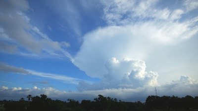
Satellite images complement weather maps by showing cloud formations and their movements. Infrared satellite imagery reveals cloud top temperatures, helping to identify thunderstorm strength. Visible satellite images show cloud shapes and shadows during daylight hours.
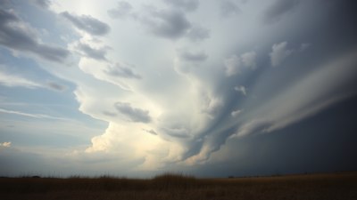
Meteorologists use satellite data combined with surface maps to assess storm size, progression, and potential impact. Recognizing cloud patterns, such as thick cumulonimbus clouds, can indicate severe weather ahead.
Combining Map Elements for Forecasting
Reading a weather map effectively means synthesizing all these elements: pressure systems, fronts, temperatures, wind, precipitation, and clouds. Meteorologists analyze their interplay to predict weather changes. For example, the approach of a low-pressure system with an advancing cold front, rising dew points, and increasing wind speeds often signals an incoming storm.
Practice by examining real-time weather maps and comparing your interpretations with official forecasts. Over time, you will develop an intuitive grasp of weather patterns and become adept at anticipating changes.
Weather Map Symbols and Legend
Familiarizing yourself with common symbols used on weather maps is vital. Besides pressure highs and lows, fronts, and wind barbs, maps feature symbols for fog, rain, snow, thunderstorms, and special weather advisories. Legends provided with maps decode these symbols, ensuring clarity in interpretation.
For instance, a dot often represents rain, an asterisk stands for snow, while lightning bolts indicate thunderstorms. Keeping a symbol chart handy can be particularly helpful during early learning stages.
Practical Tips for Reading Weather Maps
Start by identifying major pressure systems and fronts to grasp the overarching weather pattern. Next, examine temperature and dew point distributions to assess humidity levels. Check wind directions and speeds to understand air mass movements. Look for precipitation areas on radar overlays and observe cloud cover from satellite images.
Notice how these elements evolve over time by comparing sequential maps. This approach will enhance your ability to track weather system progressions, making your forecasts more reliable.
Advanced Concepts: Weather Map Analysis Tools
Meteorologists often use additional analysis tools like thickness lines, which represent the vertical thickness between pressure levels and indicate temperature profiles. They help in identifying rain-snow lines and freezing levels.
Another tool is the vorticity map, which highlights areas of atmospheric spin, signaling potential storm development. Understanding these advanced elements can deepen your grasp of weather systems’ complexity.
Common Mistakes to Avoid
Beginners often misinterpret wind directions by confusing the direction the wind comes from with the direction it is blowing to. Remember, wind barbs point toward the source, not where the wind is going. Another frequent error is overlooking the impact of local terrain, which can alter conditions like wind patterns and temperatures.
Additionally, focusing on a single map element rather than integrating all data can lead to inaccurate interpretations. Always consider the full picture to understand the weather situation correctly.
Resources for Continued Learning
To improve your skills in reading weather maps, utilize online resources such as the National Weather Service website, official meteorological organizations, and weather apps that provide interactive maps. Educational books on meteorology also offer in-depth explanations and practice exercises.
Engage with weather enthusiast communities online to exchange insights and discuss map interpretations. Real-time practice combined with expert guidance fosters a strong foundation in meteorological analysis.
By mastering weather maps, you gain a powerful tool to understand atmospheric behavior and make informed decisions related to weather impact on daily life, travel, and safety. This knowledge bridges the gap between complex meteorological science and practical everyday use.