How to Read a Skew-T Chart Like a Meteorologist
Learn how to interpret a Skew-T chart like a meteorologist with this detailed guide covering all key elements and analysis methods.
Skew-T charts, also known as Skew-T Log-P diagrams, are essential tools used by meteorologists for analyzing the atmosphere's vertical profile. These charts provide crucial information about temperature, humidity, and wind at various altitudes, enabling forecasters to assess stability, cloud formation, and potential weather phenomena. Understanding how to read a Skew-T chart is fundamental for anyone interested in meteorology or atmospheric sciences.
This article presents a comprehensive guide that explains each component of the Skew-T chart, how to interpret the data, and practical applications for weather analysis.
What Is a Skew-T Chart?
A Skew-T chart is a type of thermodynamic diagram used to plot temperature, dew point, and pressure data collected from atmospheric soundings, typically via weather balloons. The chart's unique feature is its 'skewed' temperature lines that run diagonally upward from left to right, which helps separate temperature profiles vertically for better visualization.
Pressure is plotted on the vertical axis and decreases logarithmically from the surface upward to the stratosphere. Temperature is plotted on the horizontal axis but skewed to the right at a 45-degree angle, providing a convenient layout to analyze atmospheric stability and moisture content.
Basic Components of a Skew-T Chart
Before diving into data analysis, it’s crucial to identify the primary elements on the chart:
- Pressure Lines: Horizontal lines spaced logarithmically and labeled in millibars (mb) or hectopascals (hPa). These represent the altitude levels, with the surface pressure at the bottom (around 1000 mb) and pressures decreasing with height.
- Temperature Lines: Diagonal lines slanting from lower left to upper right, called 'skewed' temperature lines. These lines are used to read ambient temperature values at various pressure levels.
- Dry Adiabats: Curved lines slanting from lower right to upper left represent the rate at which unsaturated dry air cools or warms with height, approximately 9.8°C per km.
- Moist Adiabats: Curves that show the temperature change rate in saturated ascending parcels where condensation occurs, cooling at a lesser rate due to latent heat release, usually between 4°C and 7°C per km.
- Mixing Ratio Lines: Nearly horizontal curved lines indicating the water vapor mixing ratio, in grams of water vapor per kilogram of dry air. These help estimate moisture content.
- Temperature Line (Environmental Temperature): Plotted as a solid line showing the actual ambient temperature profile from the surface upward.
- Dew Point Line: Plotted alongside the temperature line, it represents the dew point temperature, providing insight into moisture levels.
- Parcel Trace: An optional plotted path representing the temperature change of an air parcel lifted adiabatically from the surface through various altitudes.
Pressure Scale and Altitude Representation
The vertical axis corresponds to atmospheric pressure in millibars, which decreases exponentially with height. Mapping pressure logarithmically allows for greater resolution near the surface where weather phenomena are most active. Approximate altitudes can be derived from pressure values—for example, 1000 mb corresponds to near surface level, 850 mb around 1.5 kilometers, 700 mb about 3 kilometers, 500 mb near 5.5 kilometers, and 300 mb at roughly 9-10 kilometers altitude.
Reading Temperature and Dew Point Lines
The temperature line plots the ambient atmospheric temperature at each pressure level, allowing you to see how temperature changes with altitude. The Dew Point line closely follows the temperature line when the relative humidity is high, which suggests saturated conditions or cloud formation. When the temperature and dew point lines are far apart, the air is dry, and cloud formation is unlikely.
The proximity of the temperature and dew point lines is critical in determining moisture and cloud presence. When these lines converge, it indicates the lifting condensation level (LCL), representing the altitude where an air parcel becomes saturated and clouds begin to form.
Understanding Adiabatic Processes
Adiabatic processes describe temperature changes in a parcel of air as it moves vertically without heat exchange with the environment. There are two main types to consider:
- Dry Adiabatic Lapse Rate (DALR): The rate at which unsaturated air cools as it rises or warms as it descends, about 9.8°C per kilometer.
- Moist Adiabatic Lapse Rate (MALR): The slower rate at which saturated air cools due to latent heat release during condensation, ranging between 4°C and 7°C per kilometer.
Dry adiabats on the Skew-T chart help visualize how temperature changes for air parcels that aren’t saturated, while moist adiabats indicate the temperature change for saturated parcels. This distinction is vital in assessing atmospheric stability.
Mixing Ratio and Moisture Content
Mixing ratio lines indicate the amount of water vapor in the air relative to dry air and are essential for assessing humidity at different altitudes. They run nearly horizontally and slightly curve upward toward the right side of the chart. By comparing dew point temperatures to these lines, you can estimate moisture content in grams per kilogram.
Assessing Atmospheric Stability
One of the primary uses of Skew-T charts is to evaluate atmospheric stability—whether air parcels will rise freely to form clouds or sink and inhibit cloud development.
By following these steps, you can assess stability:
- Start by plotting the environmental temperature profile.
- Lift a parcel from the surface temperature along the dry adiabat until it reaches the dew point temperature, layer at which saturation (cloud base) occurs.
- From the condensation level upward, follow the moist adiabat to represent the parcel’s temperature as it continues to rise.
- Compare the parcel temperature to the environment temperature at various altitudes.
If the parcel is warmer than the environment, it is less dense and tends to rise—indicating instability. If it is cooler, the parcel tends to sink—indicating stability. When temperatures are nearly equal, the air is neutral.
Key Stability Indices Derived from Skew-T Data
Meteorologists use several indices calculated from Skew-T charts to quantify stability:
- Convective Available Potential Energy (CAPE): The positive area where the parcel temperature is warmer than the environment, indicating energy available for convection.
- Convective Inhibition (CIN): The negative area where the parcel is cooler than the environment, representing resistance to upward motion.
- Lifted Index (LI): The difference in temperature between the environment and a parcel lifted to 500 mb. Negative values suggest instability.
- Total Totals Index (TTI): Combines temperature and moisture data to estimate thunderstorm potential.
Identifying the Lifting Condensation Level (LCL)
The LCL represents the height where an air parcel becomes saturated when lifted dry adiabatically. On the Skew-T chart, it corresponds to the intersection of the parcel’s dry adiabat (starting at surface temperature) and the mixing ratio line that corresponds to the surface dew point. Finding the LCL helps predict the base height of clouds forming as air parcels rise.
Determining the Level of Free Convection (LFC)
The LFC is the altitude where the lifted parcel temperature becomes warmer than the environment, allowing it to rise freely without further forcing. It can be identified by tracing the parcel's moist adiabat from the LCL upward until it crosses to the right of the environmental temperature profile. Above this level, convection can accelerate, potentially leading to storms.
Identifying the Equilibrium Level (EL)
The EL is the height where the parcel temperature cools enough that it matches the environment temperature again after being warmer for some altitude. It often corresponds to the anvil height of thunderstorms where vertical development stops. Finding the EL involves following the parcel moist adiabat upward until it intersects the environmental temperature profile on the cooler side again.
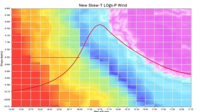
Interpreting Wind Barbs on a Skew-T Chart
Many Skew-T charts include wind barbs plotted on the right side corresponding to pressure levels. These barbs indicate wind speed and direction, vital in assessing vertical wind shear and storm potential. The barbs point toward the direction the wind is blowing to, while their number and style indicate speed:
- Short barb = 5 knots
- Long barb = 10 knots
- Triangle = 50 knots
Understanding wind profiles helps in forecasting severe weather and determining storm movement and organization.
Assessing Cloud Layers, Temperature Inversions, and Moist Layers
The close proximity of the temperature and dew point lines suggests near-saturation and cloud presence. Multiple layers where the lines approach closely can indicate multi-level cloud decks or moist layers. Conversely, a significant gap indicates dry layers.
Temperature inversions are evident when the environmental temperature line slopes upward with height instead of the usual downward trend. Inversions trap pollutants and moisture near the surface, creating fog or poor air quality situations.
Applications of Skew-T Chart Analysis
Skew-T charts serve various practical purposes in meteorology:
- Forecasting Thunderstorms: By analyzing instability, moisture, and wind shear, meteorologists anticipate thunderstorm development and severity.
- Aviation: Pilots use Skew-T information to understand turbulence, icing conditions, and cloud layers for flight safety.
- Severe Weather Warnings: Stability metrics from Skew-Ts inform warnings for tornadoes, hail, or flash floods.
- Research and Climate Studies: Long-term soundings analyzed with Skew-T charts help understand atmospheric trends and variability.
Steps to Practice Reading a Skew-T Chart
1. Identify the pressure, temperature, dew point, and wind components on the chart.
2. Note the surface temperature and dew point; find the LCL by tracing along the dry adiabat and mixing ratio lines.
3. Plot a parcel ascent path starting at surface temperature along the dry adiabat to the LCL, then along the moist adiabat upward.
4. Compare parcel temperature with environmental temperature to assess stability; identify LFC and EL levels.
5. Observe the closeness of temperature and dew point lines to evaluate moisture and cloud layers.
6. Check wind barbs for shear and wind speed variations with height.
Common Mistakes to Avoid
New learners often misunderstand the skewed temperature lines, confusing them with vertical lines. Remember that temperature lines slant upward to the right at a 45-degree angle, which affects how temperatures are read at various altitudes.
Another mistake is neglecting the impact of moisture on lapse rates—dry versus moist adiabatic rates must be correctly applied for accurate assessments.
Finally, misreading wind barb orientation can lead to incorrect conclusions about wind direction and speed.
Additional Resources for Mastery
For those wishing to deepen their expertise, the following resources are recommended:
- NOAA’s Storm Prediction Center Skew-T tutorial videos and interactive tools
- University meteorology course materials explaining thermodynamic diagrams
- Apps and websites offering live Skew-T data for practice
- Textbooks such as "Meteorology Today" by C. Donald Ahrens for foundational theory
Regular practice with real data enriches understanding and fluency in interpreting Skew-T charts, crucial for professional meteorologists and enthusiasts alike.
Ultimately, mastering how to read a Skew-T chart unlocks deeper insights into atmospheric behavior, enabling informed weather forecasting and greater appreciation of weather dynamics.